Empowering the people who power financial institutions.

Overview
Continuous
Continuous gives financial institutions the intelligent automation solutions needed to simplify the complex and focus on what matters most.
The Challenge
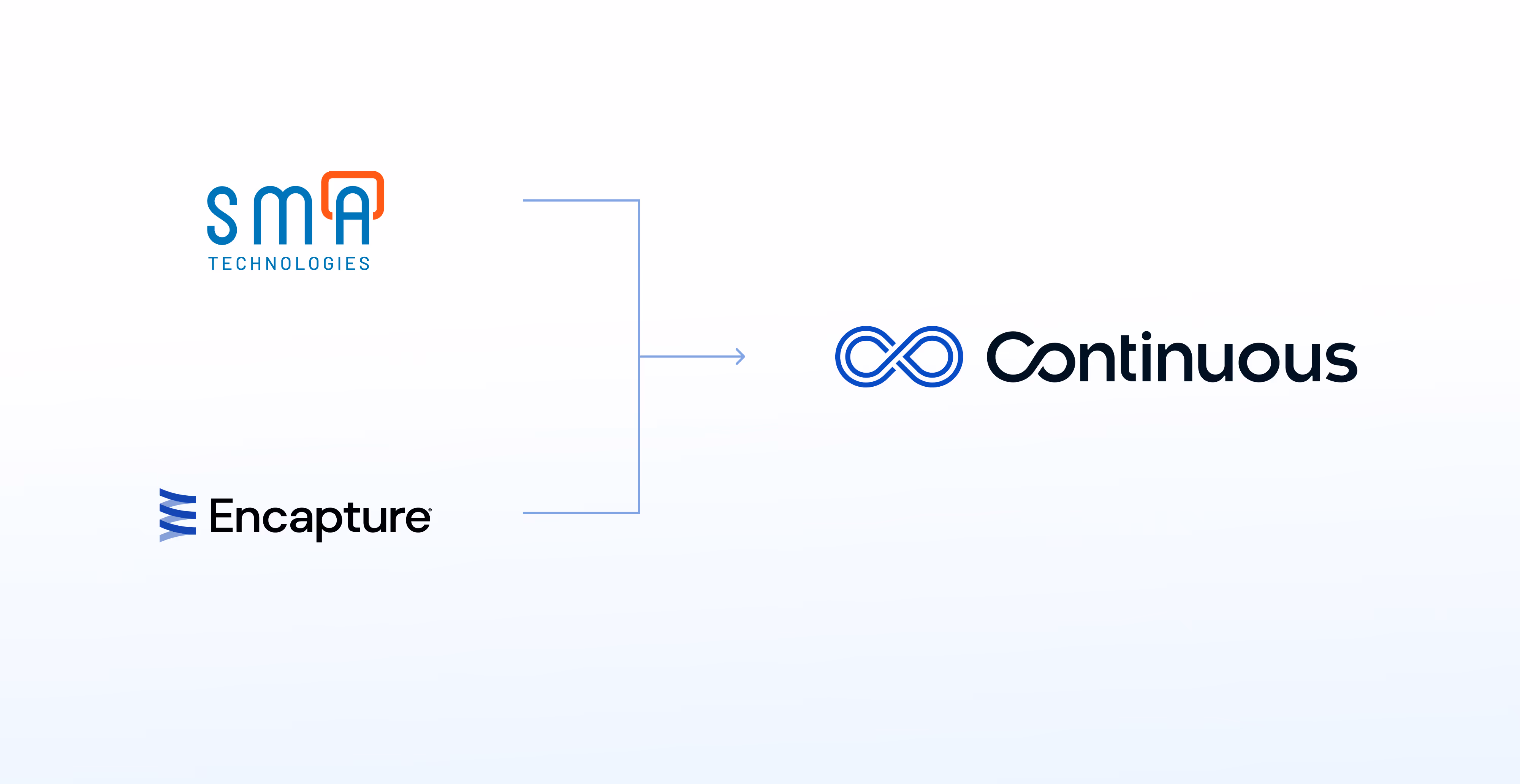
Continuous came to us at a major inflection point. After bringing SMA Technologies and Encapture together under one name, the company needed a unified identity that felt modern, warm, and built for financial institutions. Their existing brand assets were fragmented, the visuals felt a little outdated, and the market story did not match the scale of their platform. They needed a refreshed identity and a homepage that could introduce their new narrative with clarity and confidence.
Our Approach
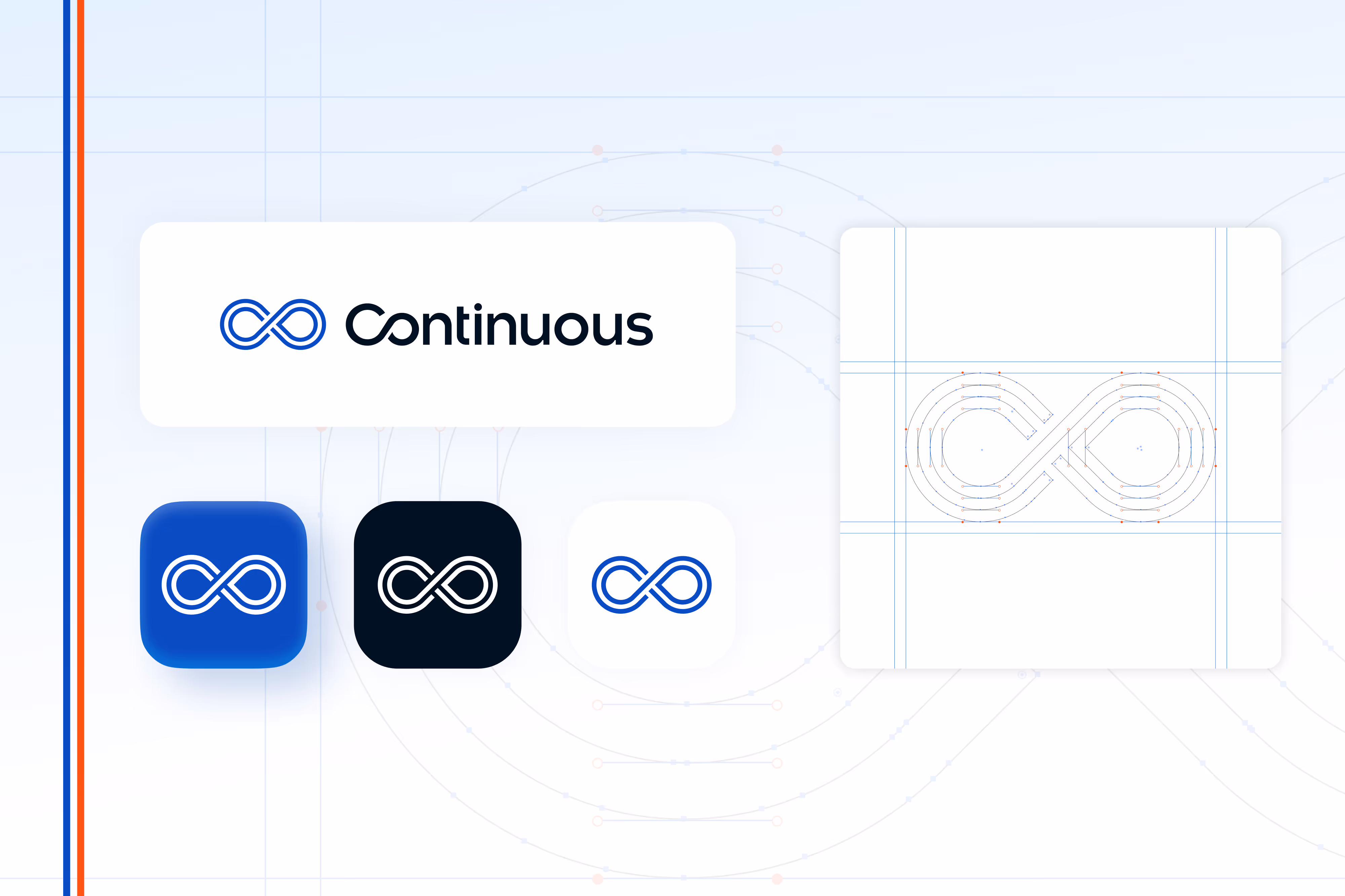
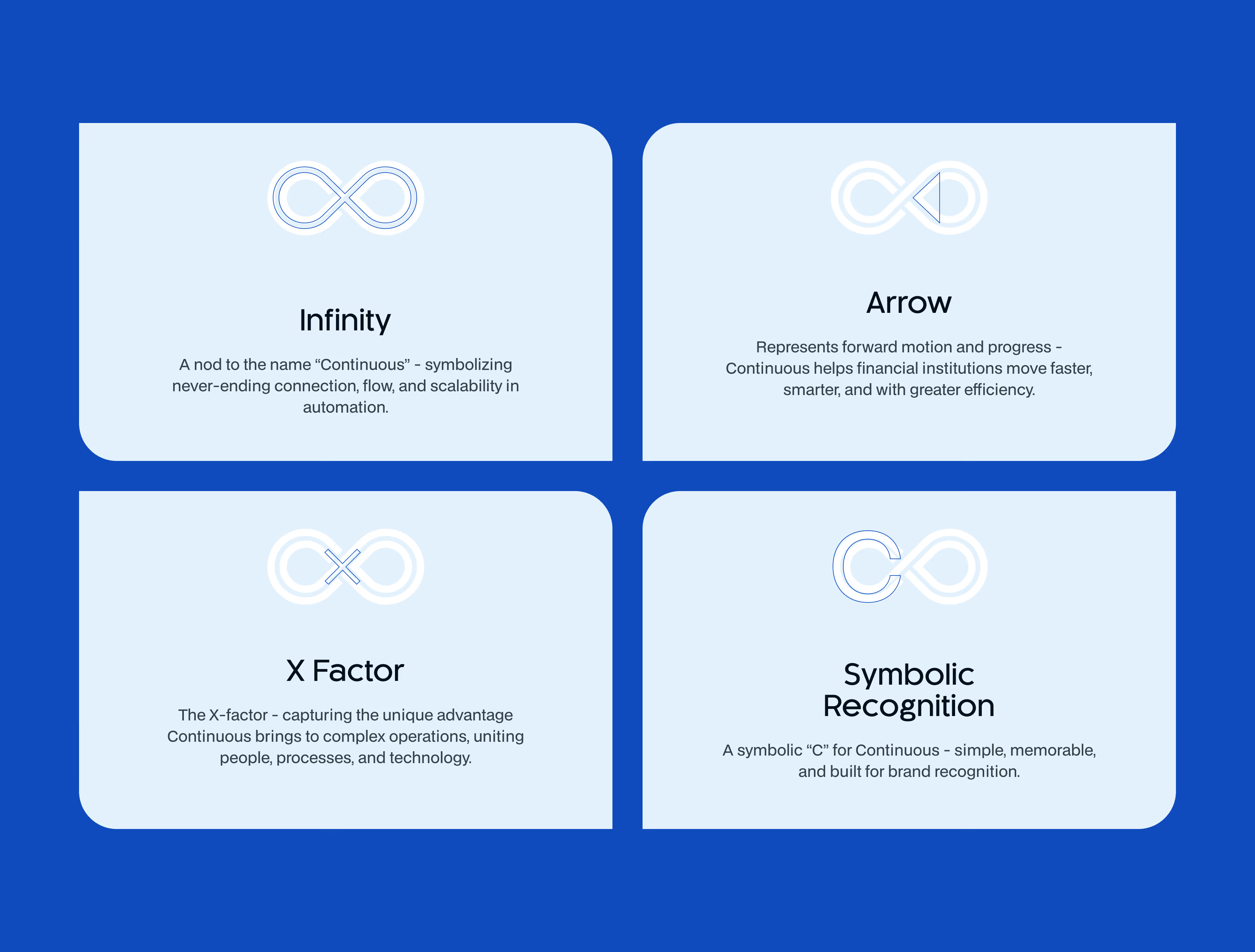
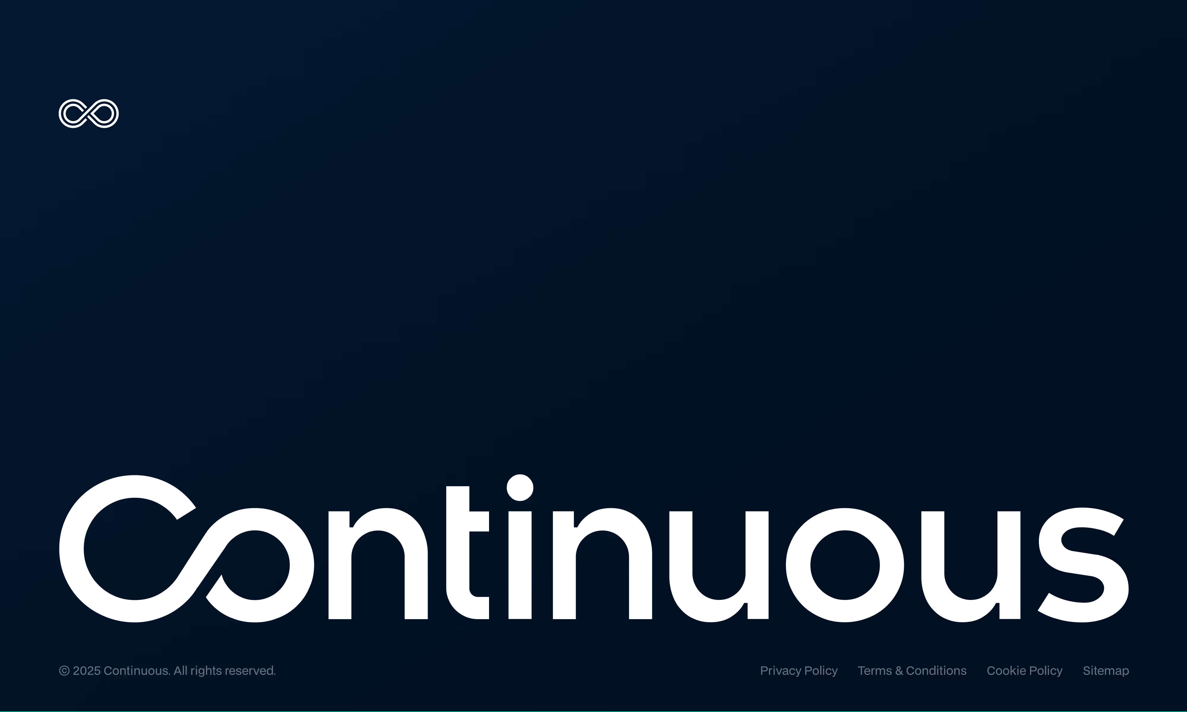
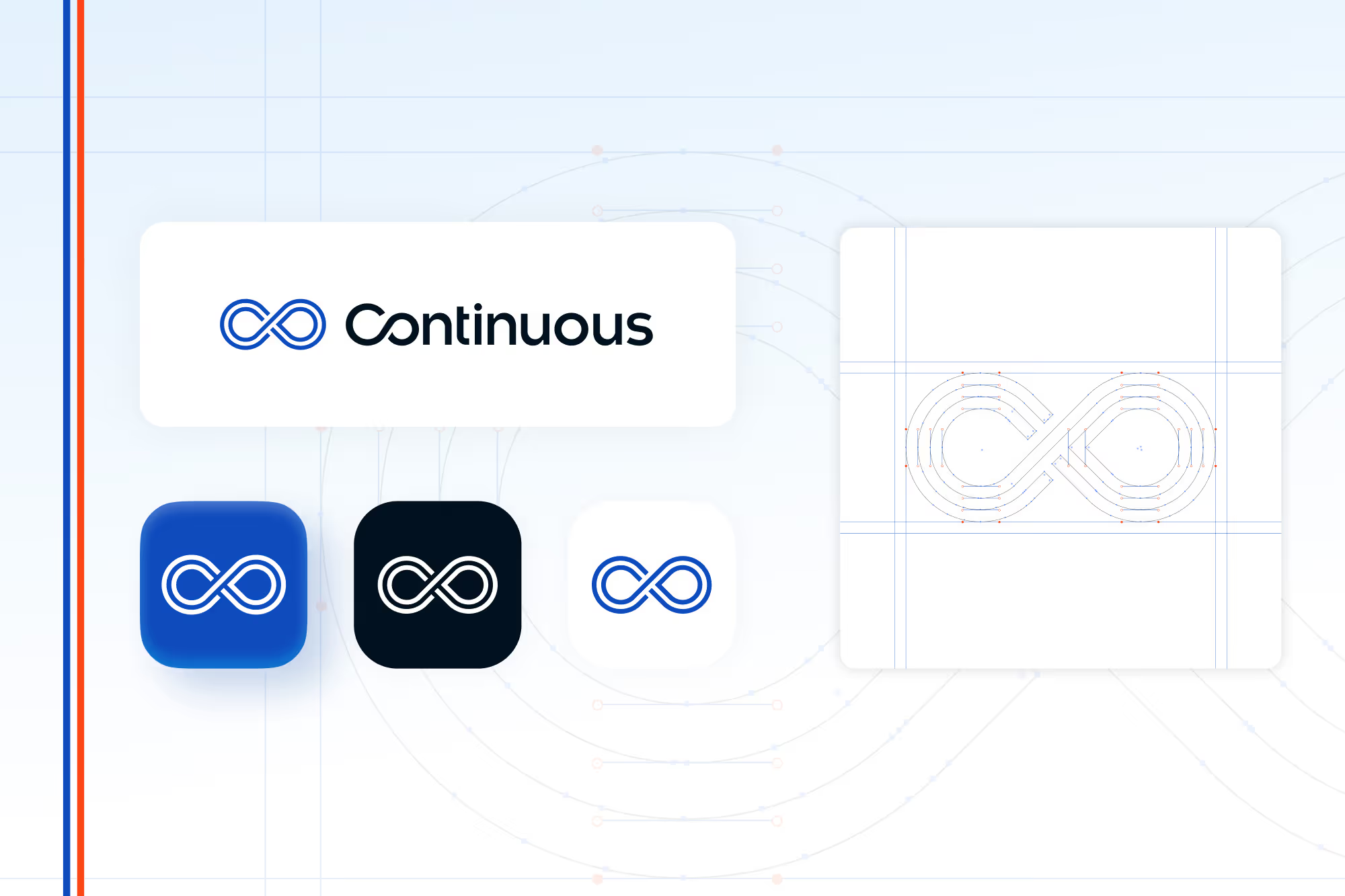
We started with a full audit of both legacy brands, competitive research, and a deep dive into the updated messaging the Continuous team was developing. This gave us a clear view of what needed to stay, what needed to go, and what would help them stand out in a crowded automation space.The MarkA core part of the engagement was creating a logo that could carry the new name and story forward. The final mark blends four symbolic ideas into one simple, memorable form:
- An Infinity Symbol to represent the Continuous name, ongoing connection, flow, and scalability.
- A forward-facing Arrow that signals progress and momentum.
- A central intersecting X mark that reflects the X-Factor, the unique advantage Continuous brings to people, processes, and technology.
- A Symbolic C shape, clear and recognizable, that reinforces the brand and builds long-term recognition.
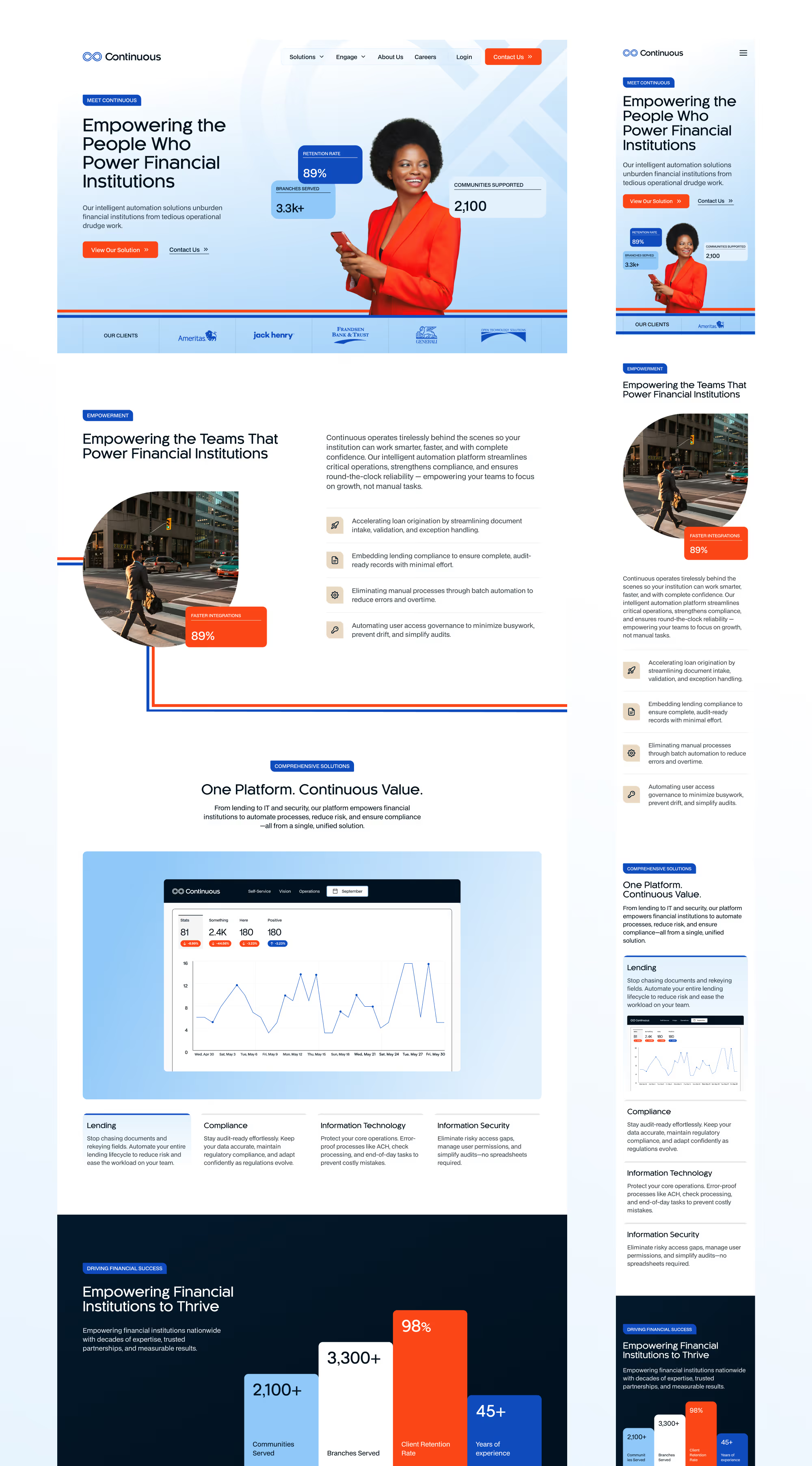
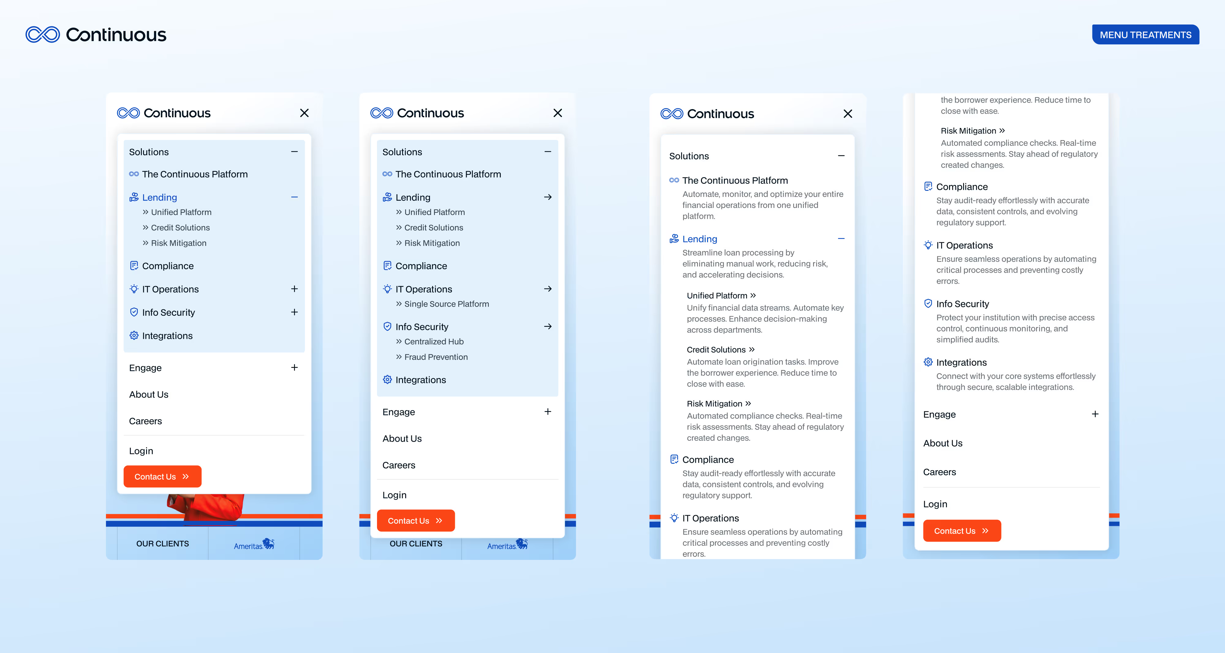
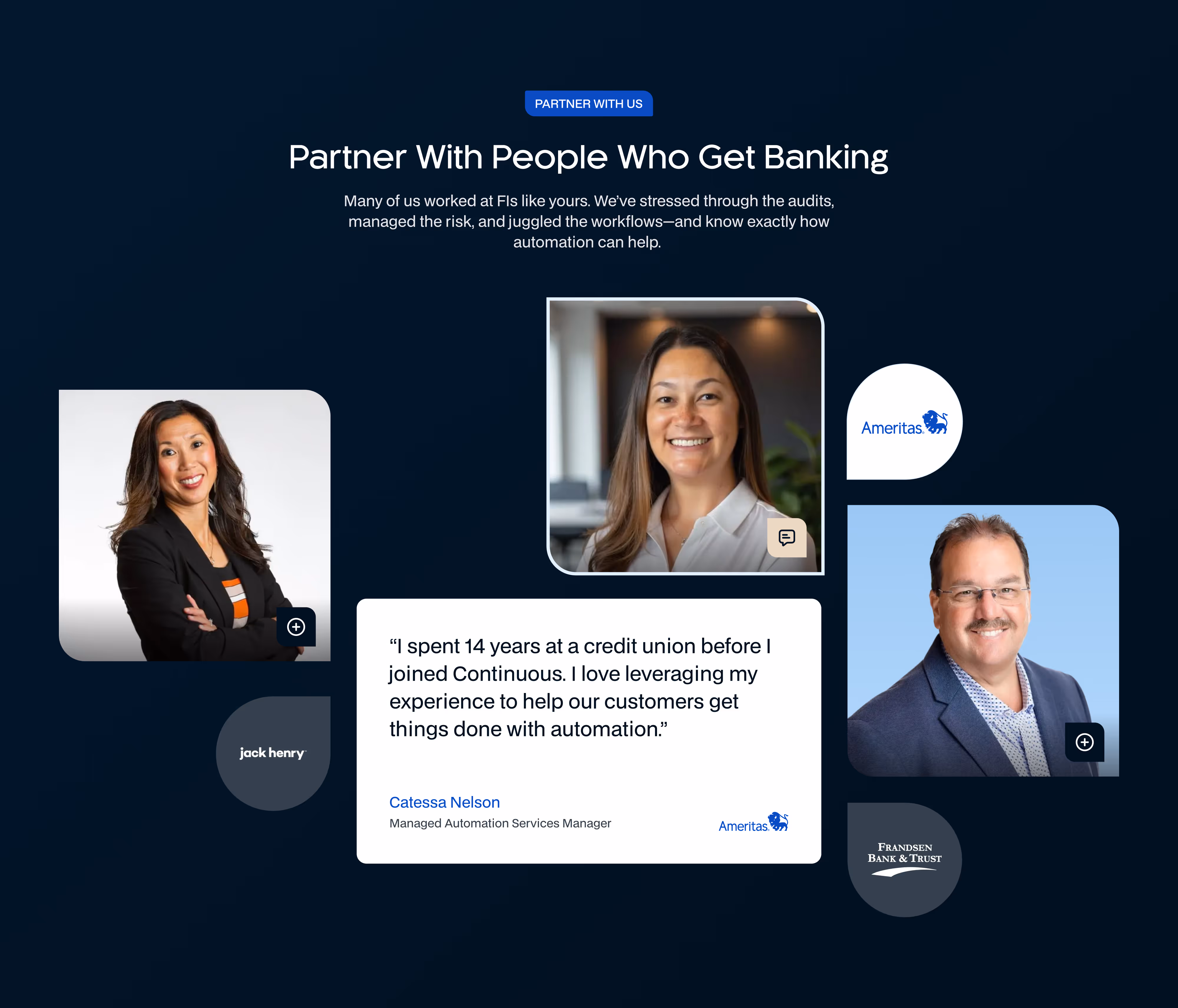
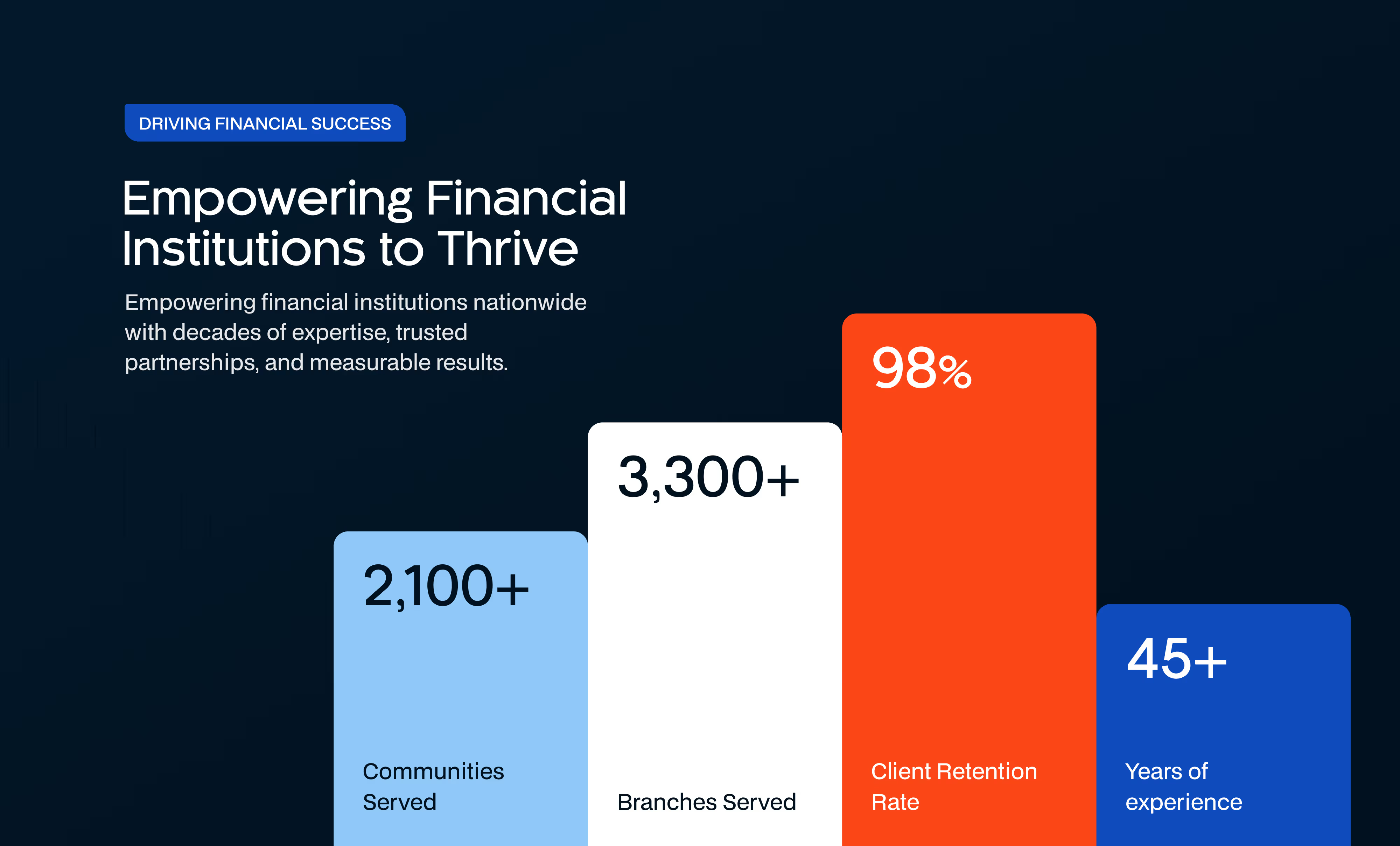
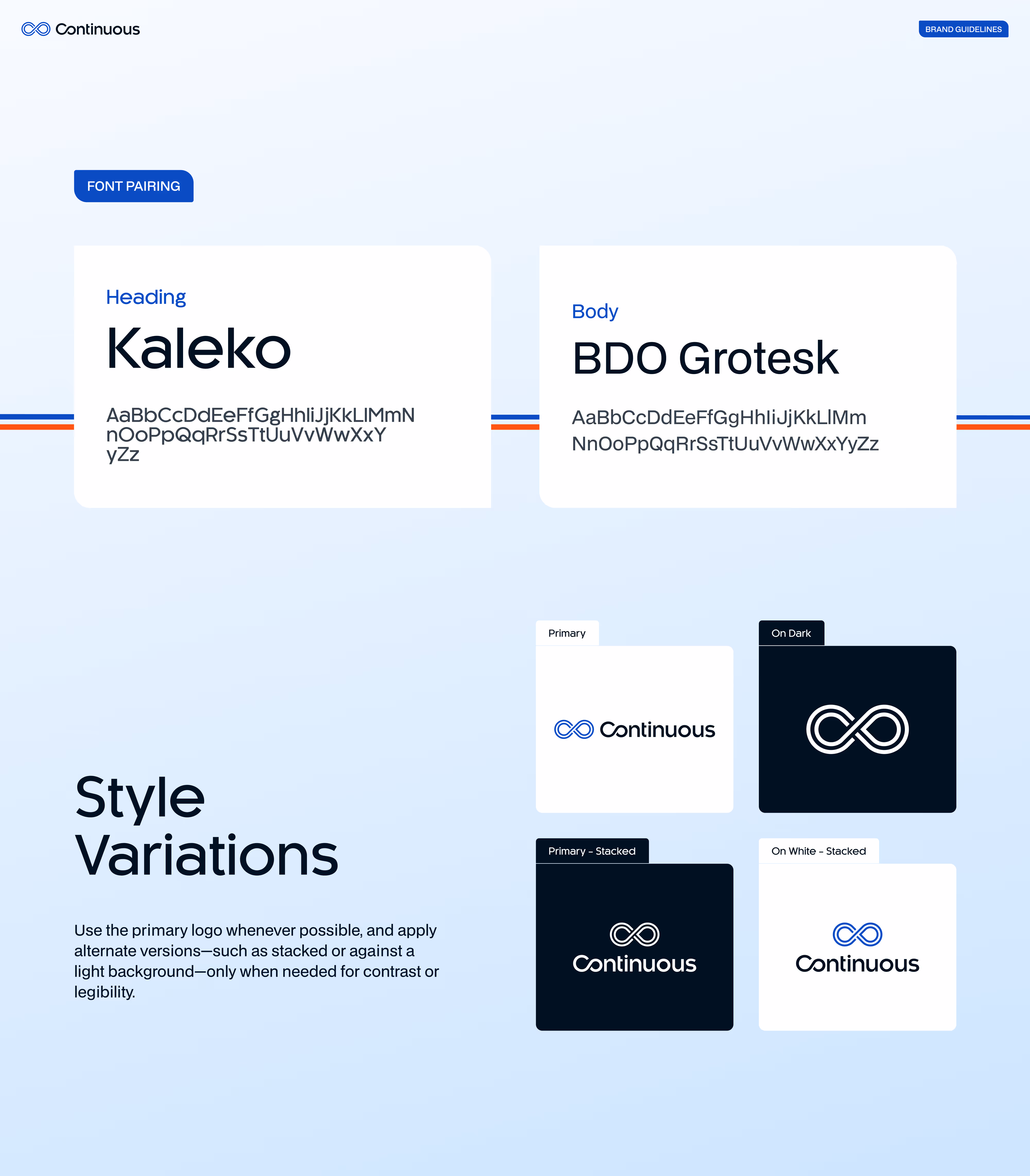
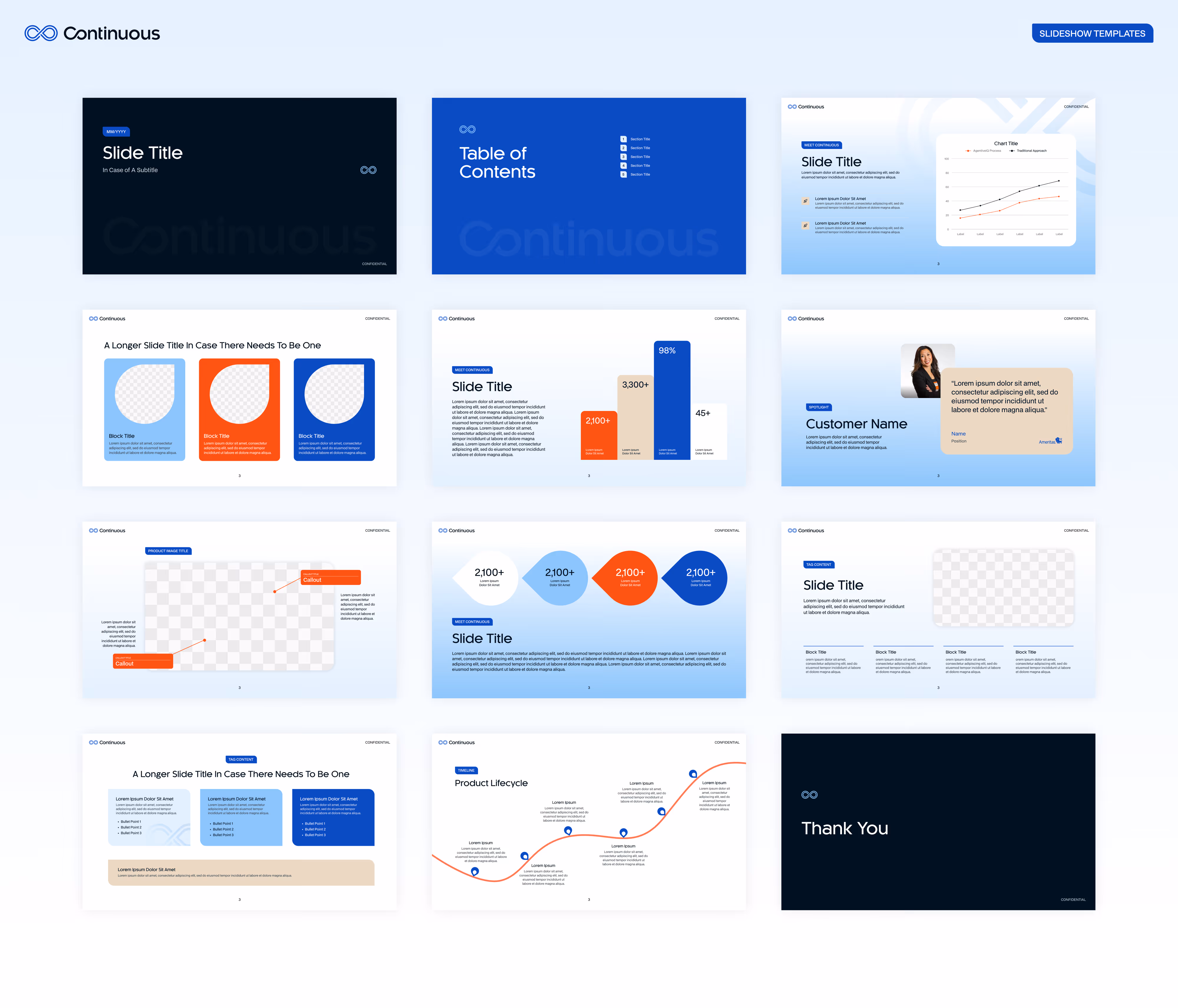
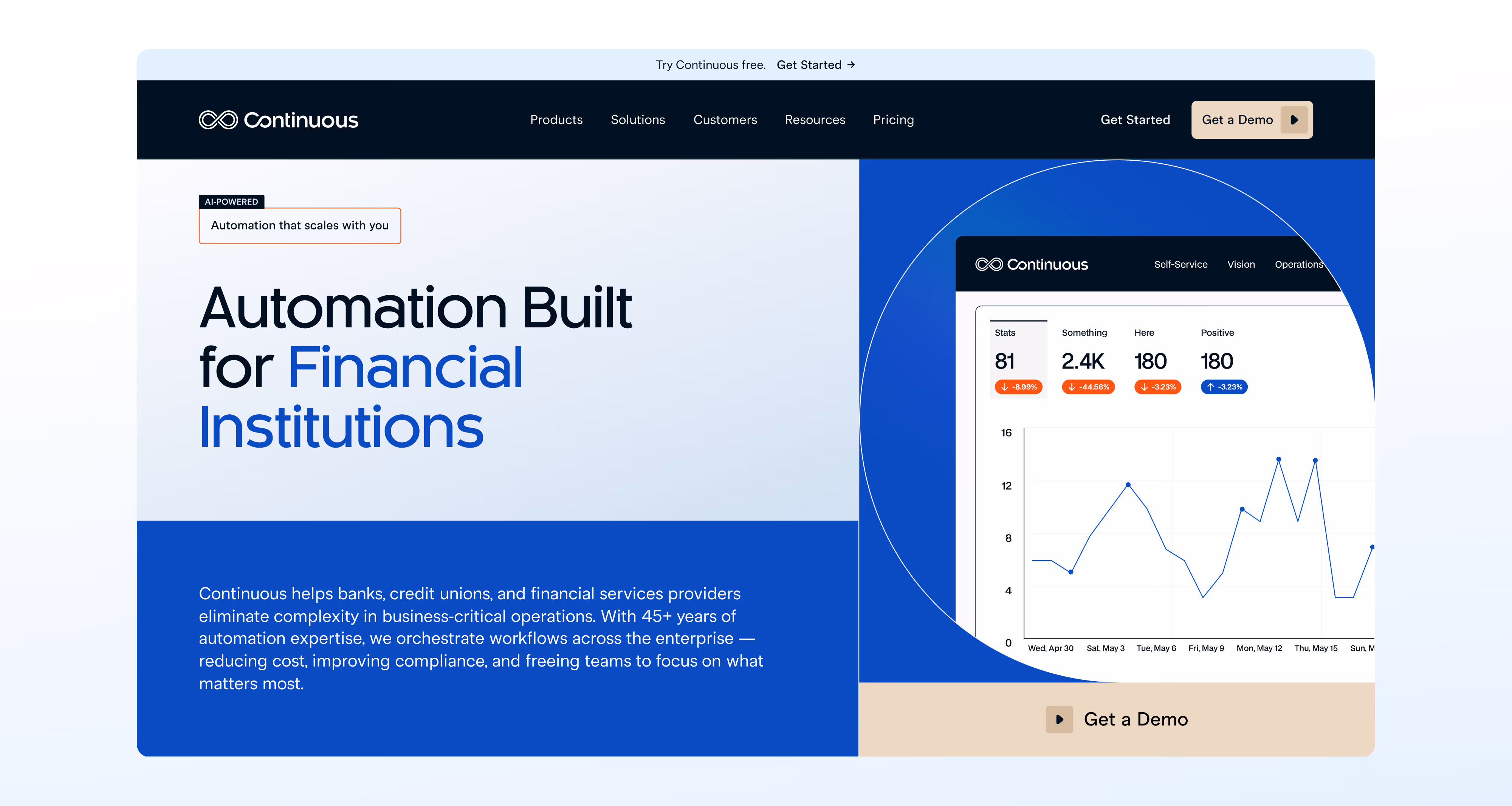
This geometry became the anchor for the entire visual system.Identity SystemFrom there, we built a modern and human visual language that reflects how Continuous supports financial institutions. The system features a refined color palette that blends Encapture’s tones with SMA’s orange, clean typography using Kaleko and BDO Grotesk, warm photography, flexible layout grids, and a presentation toolkit for the team. Every element was created to scale across digital, product, and sales channels.Homepage RedesignTo bring the identity to life, we designed a refreshed homepage that introduces Continuous as a bastion of clarity and trust. The layout highlights real people, strong social proof, clear product pillars, and simple storytelling around automation. It sets the tone for a full website redesign and gives the team a digital foundation that feels modern, credible, and aligned with the new brand.
The Final Point
Continuous now has a unified identity that honors its history and clearly signals its future. The brand is warm, professional, and built for the way financial institutions evaluate partners. The refreshed homepage gives the market a clear introduction to who Continuous is, what they stand for, and why they matter.